

Notice: This portfolio page is still a 🚧 work in progress 🚧 and may appear less complete compared to other case studies on my website. I’m actively refining it to include more detailed breakdowns, annotated screenshots, and in-depth UX rationale. Thank you for your understanding!
Overview
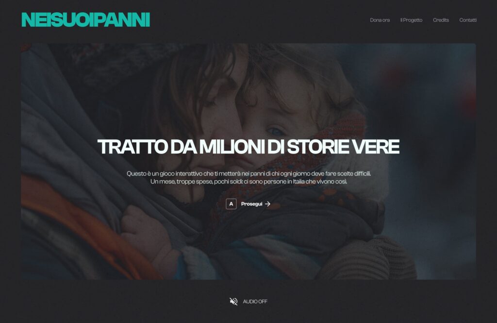
“NEISUOIPANNI” (translated in “in someone else’s place“) is a browser-based life simulation game created in collaboration with a non-profit organization that supports vulnerable communities through social projects such as clothing drives and local assistance programs.
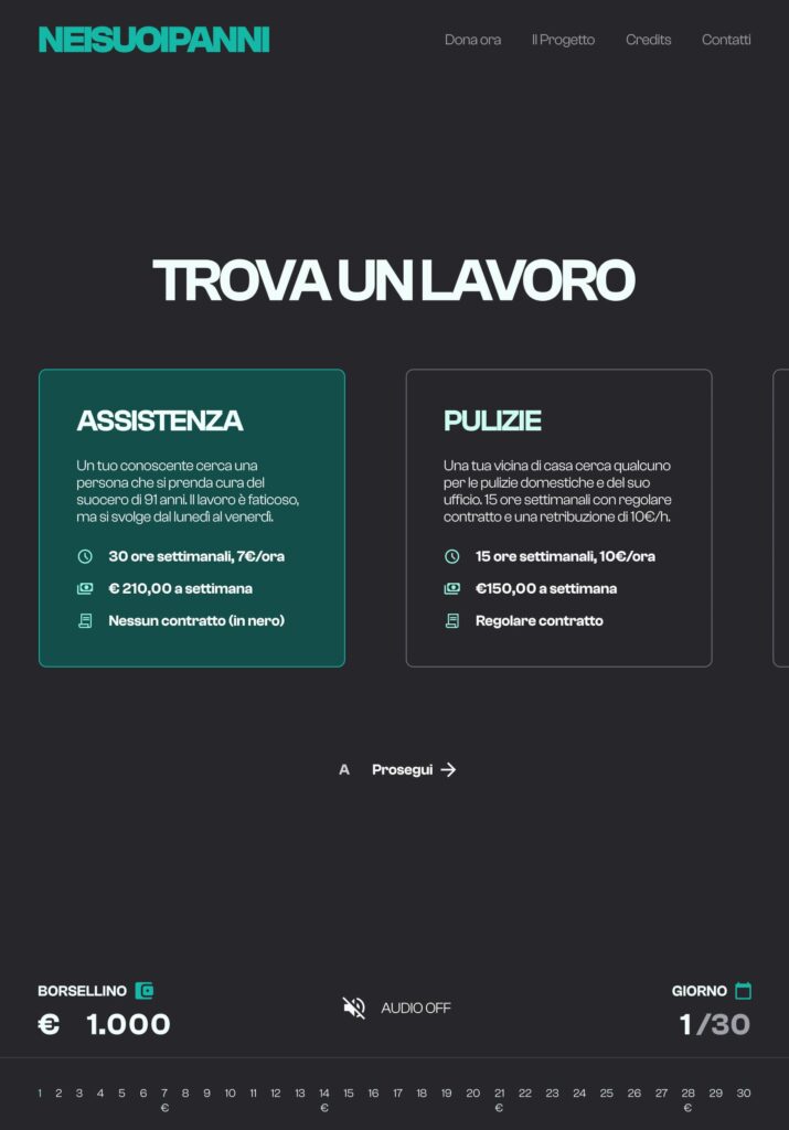
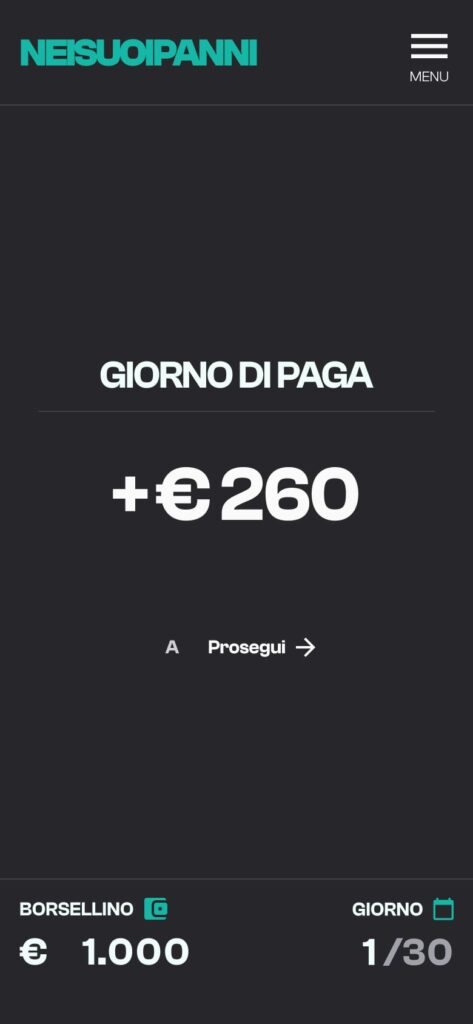
The game places users in a realistic month-long scenario where they must make tough choices managing income, unexpected expenses, and emotional fatigue – with a very limited budget. The goal is to reach the end of the month without running out of resources, while maintaining health, relationships, and dignity.
My objective was to design an experience that could inform and engage, without falling into the trap of oversimplification or gamification of poverty. The entire product was built around clarity, coherence, and emotional impact, balancing usability with storytelling.
Hypothesis
Before starting the design, we worked with the client to define assumptions and priorities, backed by insights from social workers, volunteers, and early testers. Key hypotheses included:
- Simplicity as an enabler – The UI must reduce friction, especially for non-gamers and users with limited digital literacy.
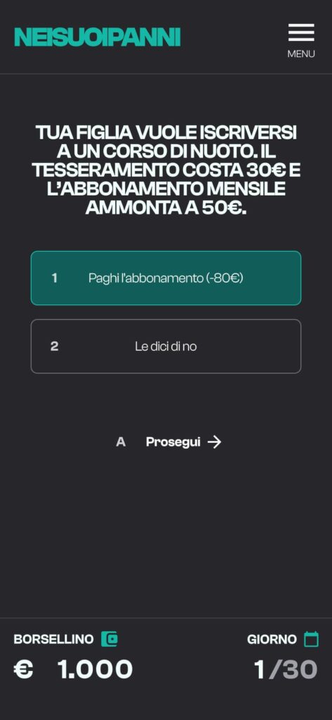
- Decision-based storytelling – A simple choice-based interaction model can evoke strong emotional engagement.
- Scalable design – The visual system must adapt to future chapters or scenarios (e.g., different cities or personal backgrounds).
- Emotional pacing – The rhythm of information and interaction should balance tension and breathing space, avoiding cognitive overload.
Colors, Styles & Components
Visual Principles
The visual system of the game was designed to balance readability, emotional tone, and consistency across the entire experience. Given the subject matter—poverty, scarcity, tough decision-making—the aesthetic avoids visual noise and embraces functional minimalism. Each element was designed to feel intentional and grounded in the emotional journey of the user.
Typography
We adopted Clash Grotesk as the core typeface, leveraging its geometric clarity and subtle tension to mirror the realism of the game narrative.
The typography system is modular, accessible, and scales across headings, UI labels, and narrative blocks. Each size and weight was defined to create a smooth hierarchy, allowing users to quickly parse critical decisions while staying immersed in the story.
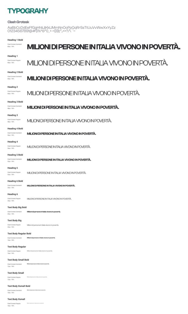
This typographic system ensures high clarity, strong structure, and a visual identity that remains distinct while being deeply usable—even on low-end devices or under cognitive load.
Color System
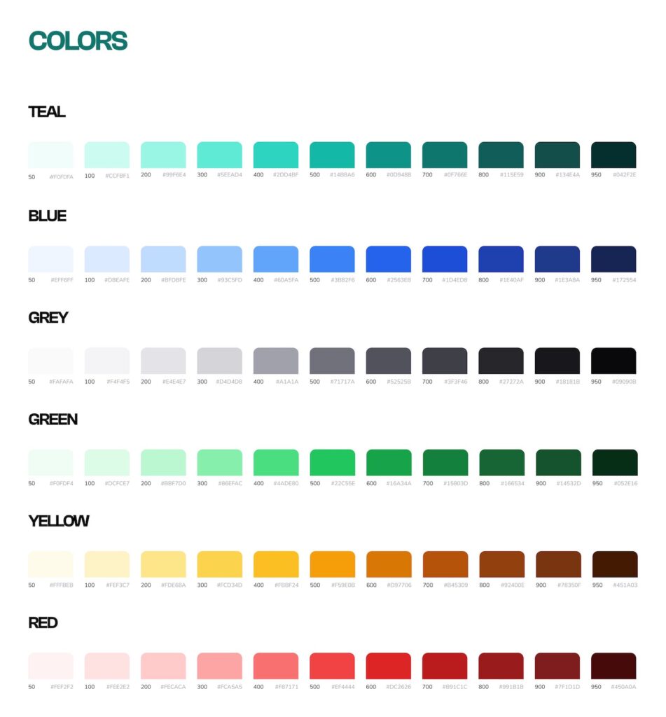
The color palette is both expressive and controlled. It uses soft, progressive shades of teal, blue, and grey as functional UI colors, while more saturated greens, reds, and yellows are reserved for feedback states and decision impact.
Each color group is structured across 10 steps (from 50 to 950), ensuring flexibility for shadows, highlights, states, and background layering.
Particular care was taken to avoid overuse of red or green, due to their cultural and emotional implications—especially in a game based on vulnerability and challenge.
Tokens and components
All interface elements were designed from scratch using a strict Atomic Design methodology, ensuring clarity, reusability, and maintainability across the product. Each UI component was broken down into its smallest parts (atoms), composed into molecules and organisms, then assembled into fully responsive templates and pages. This modular approach allowed for efficient iteration and guaranteed visual and functional consistency across every scenario.
All components were documented and structured within Figma using a comprehensive variable and token system, mapping visual properties (colors, borders, icons, text styles) to semantic states and use cases. This created a robust bridge between design and development.
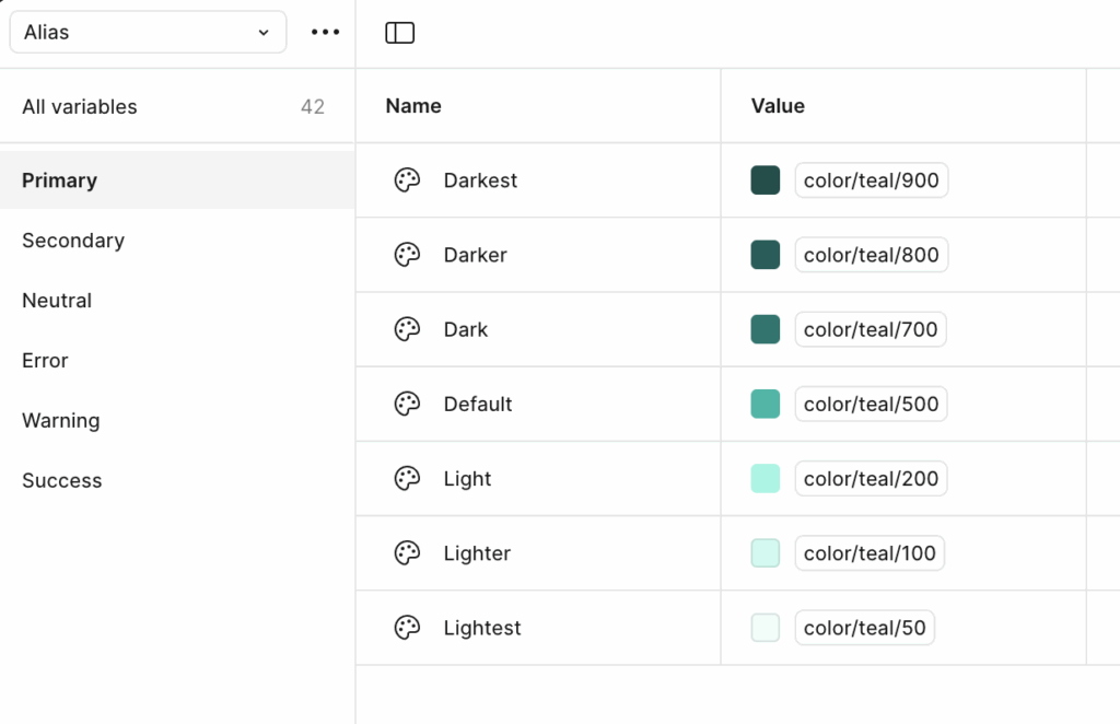
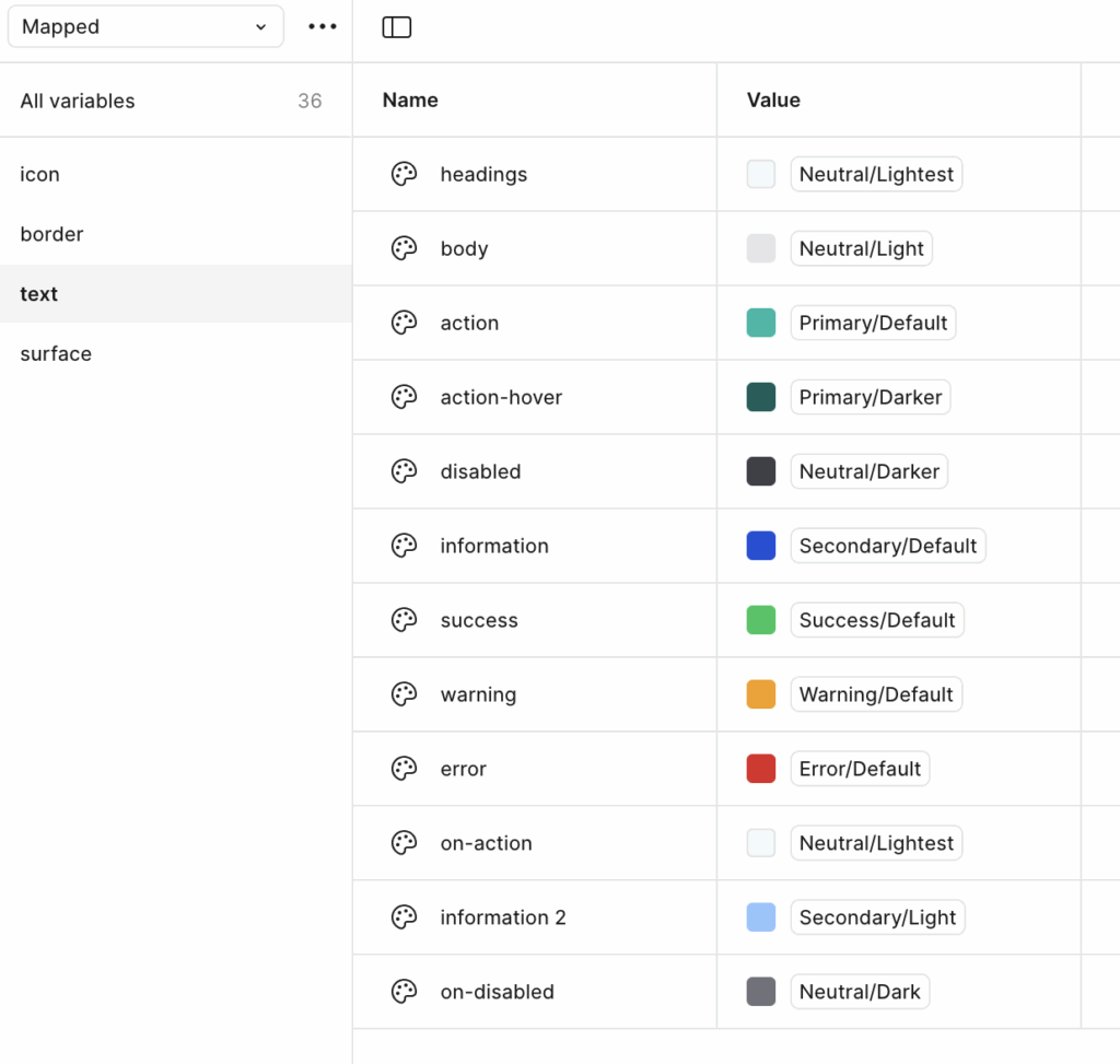
Color variables: Categorized into Primary, Secondary, Neutral, Error, Warning, Success, and more—each ranging from Lightest (50) to Darkest (950). These are mapped to usage tokens like action-hover, on-disabled, or information to allow real-time adaptation across different UI contexts and user states.
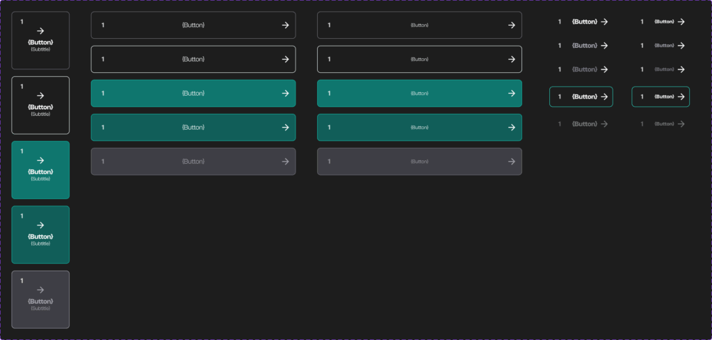
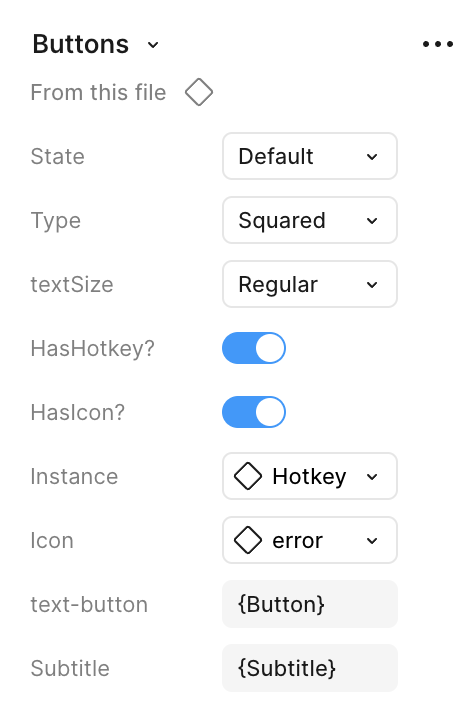
Button system: Each button variant supports multiple states (default, hover, pressed, disabled, error), optional hotkey or icon support, text sizing, and shape customization (e.g., squared, rounded). States are mapped through tokens to semantic colors (e.g., Primary/Default, Error/Default) ensuring accessibility and consistency.
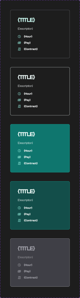
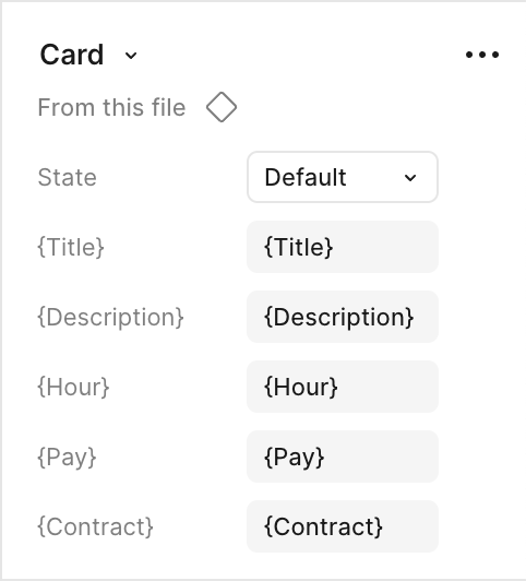
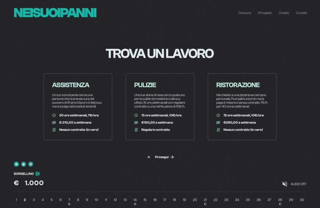
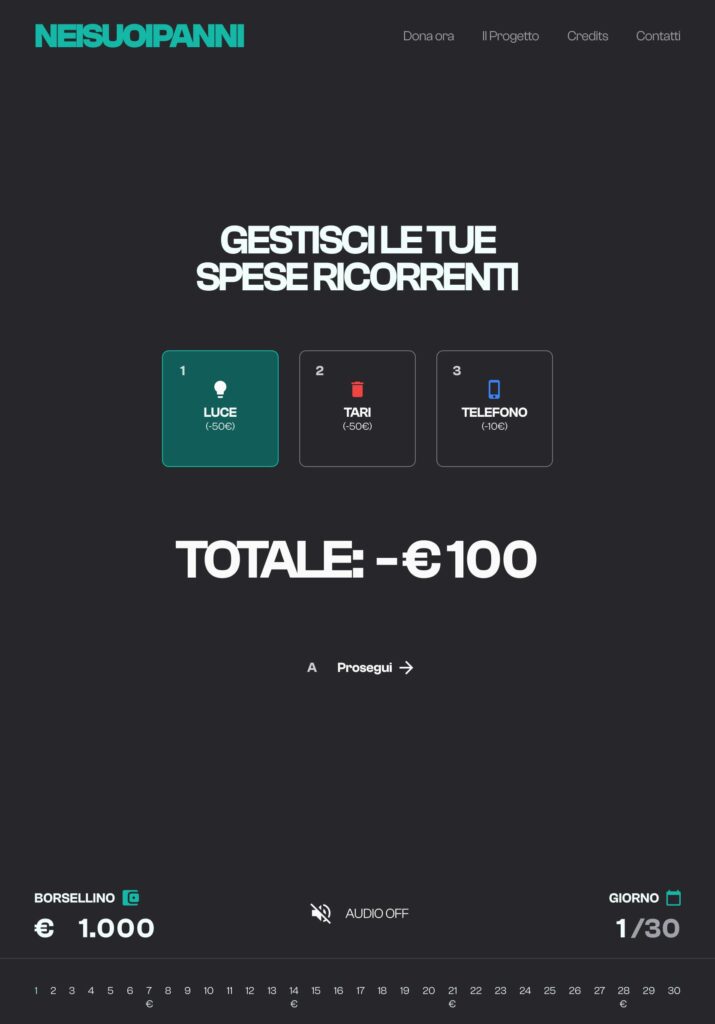
Card templates: Reusable for job offers, event outcomes, and narrative situations. Each includes dynamic slots for title, description, working hours, pay, and contract type, allowing full narrative flexibility with minimal design overhead.
Confidentiality Notice
The game is currently in beta and has not yet been released publicly.
Please treat this content as confidential and do not share it outside your company or evaluation team. It is intended exclusively for internal review as part of a job application process.

