
Overview
RemoteCareers is a growing platform for remote job opportunities, focused on digital, tech, and creative roles. After discovering the project on Reddit, I reached out directly to the owner to propose a UX review and the introduction of a scalable design system.
What started as a spontaneous contact turned into an effective collaboration between me and the full-stack developer. The goal was to support the platform’s evolution with a design system that could improve both visual consistency and usability over time.
⚠️ The new design system is currently being tested and is not yet visible on the live site.
Objectives
- Introduce a clear, reusable, and developer-friendly design system
- Improve interface consistency and usability
- Streamline implementation thanks to my front-end background
The Challenge
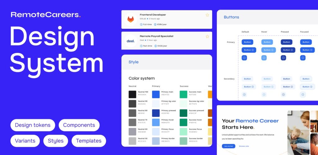
RemoteCareers had grown quickly, but without a unified visual language across its different sections. The original design was functional, but lacked a systemic structure—making future updates more difficult and inconsistent.
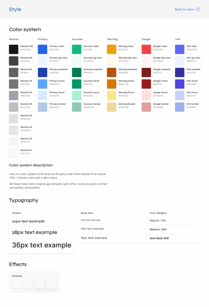
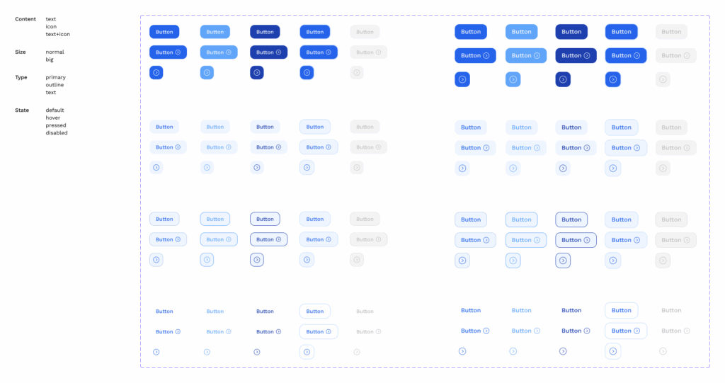
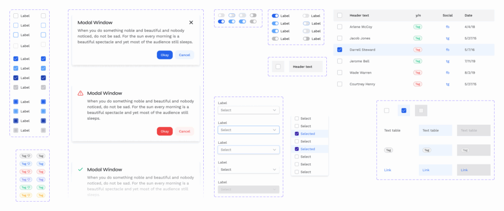
My role was to create a solid design system, based on Tailwind, and customize it to the specific needs of the platform. The challenge was to ensure brand continuity while making the system easy to integrate and scale.
Research
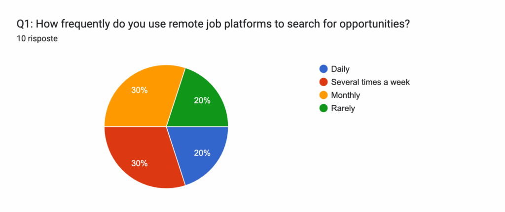
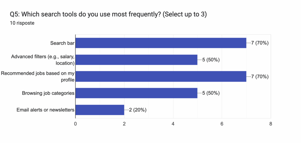
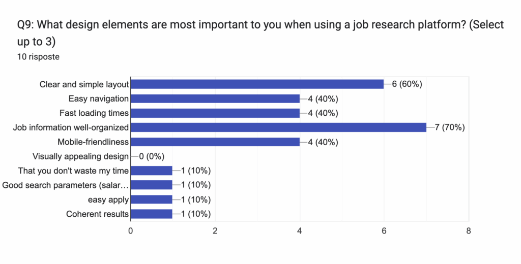
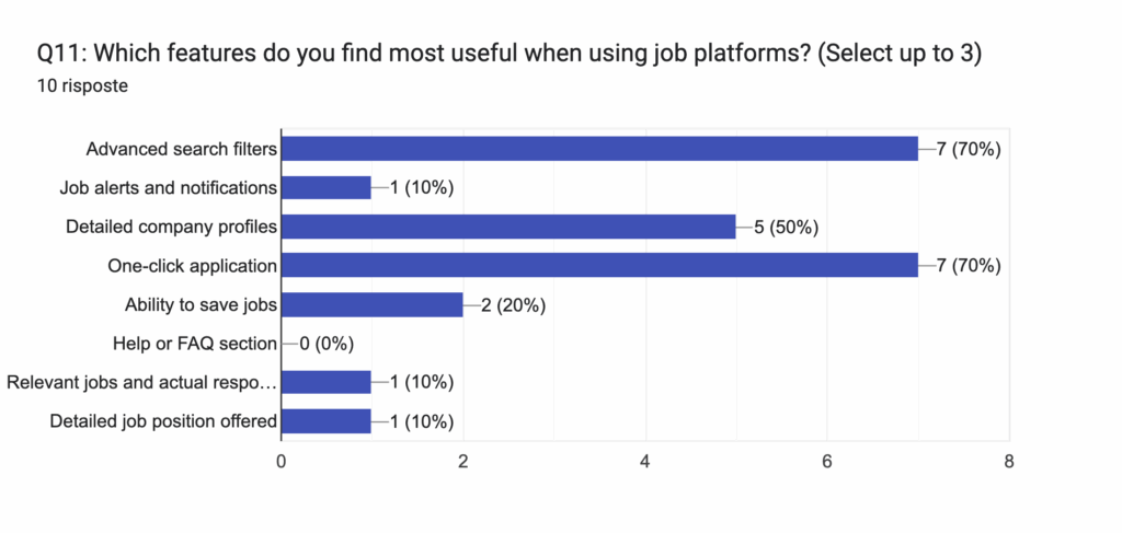
To gather qualitative insights, I designed a user survey targeted at both current and potential users of the platform. The questions explored user habits, goals, pain points, and interface preferences.
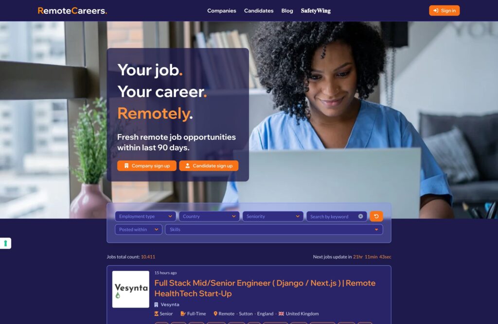
I collected and analyzed the responses (via Google Forms), identifying recurring patterns and friction points. From there, I began structuring stronger design hypotheses that guided the UX redesign of the homepage and the job detail page, as well as the development of the new component system.
Insights & Recommendation
Close collaboration with the developer made the process smooth and efficient. My front-end background allowed me to think in modular terms and design components that were development-ready, minimizing friction between design and implementation.
🎯 “Every component was built to translate directly into code, with naming conventions and logic aligned to Tailwind. This made the developer’s work faster and smoother.”
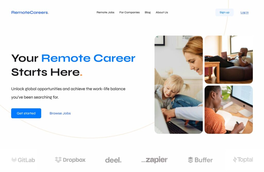
In just 4 weeks, we created a scalable, robust design system and tested it in staging. The initial feedback was highly positive, especially in terms of usability and visual clarity. The redesigned homepage and job pages now offer a much cleaner and more intuitive experience.
Next steps
We are currently monitoring the design system’s rollout in the staging environment. Over the next few months, it will be gradually implemented across the platform. Our plan is to continue gathering both qualitative and quantitative feedback to validate design decisions and adapt based on real user behavior.

